# Introduction
Here is a mostly complete collection of all the resources that went in to the creation of my site
# Art
Tiled background image: 🌍 "Skulls" by Adam, sourced from 🌍 Transparent Textures (Originally from 🌍 Subtle Patterns.)
An abstract repeatable pattern consisting of spirals, stars, clouds, hearts, droplets, and concentric circles. It is displayed against a solid navy blue background colour.
# Colour Scheme
A free online colour scheme generator called Color Palette Pro was used to generate the site's colour scheme.
At this time, I can no longer recommend the generator to visitors in good faith, as Ryan Feiganbaum, the developer for Color Palette Pro, began to integrate Claude AI into his workflow as early as May 2026.
As a consequence of this, it is no longer possible to replicate the site's colour scheme accurately, even if the exact sequence of steps are followed.
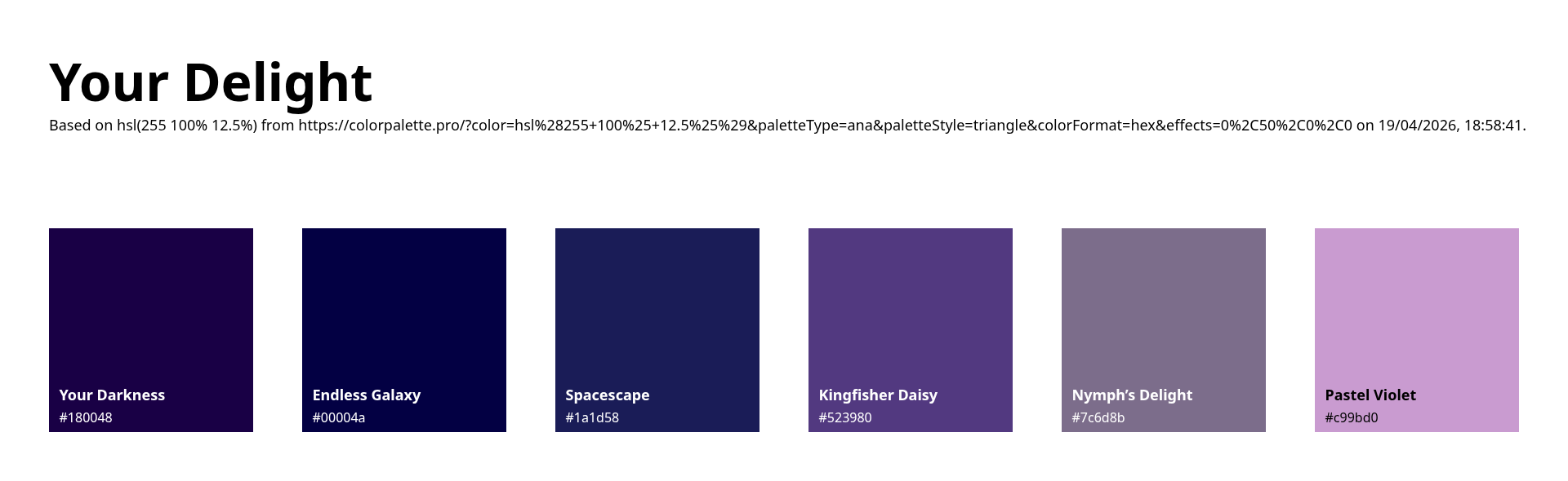
The site's Colour Scheme; "Your Delight", as generated by Color Palette Pro.
Output as displayed in the above image:
Note that this does not include the body text colour that I specified myself, which is:
A high contrast colour was necessary to help the text stand out from being displayed against a dark background colour
The colour scheme should be pleasing on the eyes even in conditions where screen dimmers and night lights are used
# Typefaces
Fonts used:-
# Tools Used
# CSS Scanlines
Q. Why the scanlines?
A. Firstly, it's a method of screen burn prevention. Secondly to give the website its retro "Web 1.0" feel, as if it was being viewed on an old school CRT type monitor.
The following Cascading Style Sheet code creates scrolling horizontal scanlines for the affected HTML element, without interfering with mouse pointer interactions, and can also be controlled by adjusting the Animation Speed settings on the client's own system
.scanlines {
overflow: hidden;
position: relative;
}
.scanlines:before,
.scanlines:after {
display: block;
pointer-events: none;
content: "";
position: absolute;
}
/* Heavy scanline that scrolls up the page */
.scanlines:before {
width: 100%;
height: 2px;
z-index: 2147483649;
background: rgba(0, 0, 0, 0.25);
opacity: 0.50;
animation: scanline 6s linear infinite;
}
/* Scanlines per line */
.scanlines:after
{
top: 0;
right: 0;
bottom: 0;
left: 0;
z-index: 2147483648;
background: linear-gradient(
to bottom, /* Gradient start position */
transparent 50%, /* Stop 1 */
rgba(0, 0, 0, 0.1875) 50% /* Stop 2 */
);
background-size: 100% 4px;
animation: scanlines 1s steps(60) infinite;
}
/* ANIMATE UNIQUE SCANLINE */
@keyframes scanline
{
0% {
transform: translate3d(0, 200000%, 0);
}
}
@keyframes scanlines
{
0% {
background-position: 50%;
}
}
@media (prefers-reduced-motion: reduce)
{
.scanlines::before,
.scanlines::after
{
animation: none;
background: none;
}
}
# Honourable Mentions and Shout-outs
In no particular order…
🗓️ Document last updated 22:41:38 2026-08-23, Object size: 4287 bytes.
Copyright LOLOLOL ©2026, all rights reserved… (Very much a work in progress!)


(pls do not hotlink these kthx.)
No rights, implied or otherwise, are hereby granted to use Artificial Intelligence (AI), Large Language Model (LLM), web crawler, bot, or automated system in order to scrape, extract, exploit, aggregate, index, reproduce, process, or otherwise collect content from this website for the purposes of training, fine-tuning, or otherwise improving any AI/LLM system, dataset, or algorithm.
All first-party content on this website is protected by copyright and may not be used in any of the aforementioned manners without first obtaining explicit written permission. Any such violation of these terms may result in legal action under applicable copyright, contract, and data protection laws. This restriction applies regardless as to whether or not the data is publicly accessible.
🏳️🌈🏳️⚧️ Made with ❤️ by a queer, for queers🏳️⚧️🏳️🌈